From the Field: 6 UX Principles for Creating Superior IoT Apps
Gain insights on six UX-driven principles for IoT app success, illustrated with examples from leading applications and one of our client case studies.
The expansion of IoT (Internet of Things) products - ranging from advanced smart devices to cutting-edge wearables - marks a pivotal shift in how we interact with technology. However, the success of these products is never based solely on the hardware's capabilities. More often, users experience these products mostly through the software that connects with them- and that experience must be seamless, easy, and compelling.
This requires taking a deeply holistic approach when designing and building IoT apps. Teams need to be fully aware of the complexities of merging physical products with digital interfaces, as well as the unique opportunities that challenge presents.
In this article, we lay out 6 UX-driven principles and strategies to help you bridge the hardware/software gap and create a first-class experience for your IoT app.
1. Find software solutions for hardware constraints
Even state-of-the-art IoT hardware products can have limitations that can impact user experience. However, instead of concentrating solely on hardware upgrades, innovative software-driven solutions can be more efficient, cost-effective, and easier to implement.
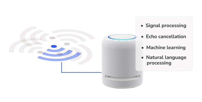
For instance, Amazon Echo's ability to recognize voice commands in noisy
environments is primarily due to sophisticated software algorithms. The
quality of the microphones also matters, but the difference is more of a
result of software algorithms that combine advanced signal processing, echo
cancellation, machine learning, and natural language processing.
In our partnership with SpotOn, we have improved the product's user experience by working through software solutions. The SpotOn collar uses over 25 simultaneous satellite connections, ensuring precise detection when a dog crosses a virtual boundary. However, like many GPS systems, there are significant challenges when using this technology indoors, as obstructions can impede signals. This was a problem for pet owners who wanted to keep the collar on when their dogs moved between indoor and outdoor spaces.
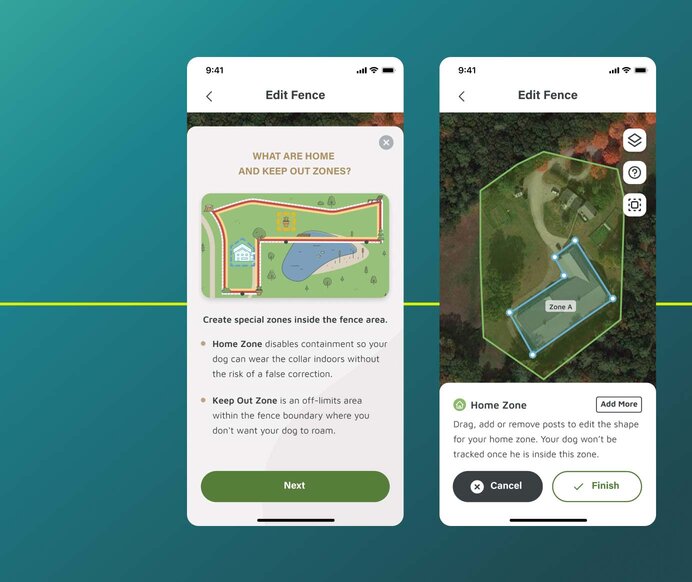
Our software-driven solution to this hardware issue was to conceptualize and integrate a "Home Zone" feature. This intuitive addition allowed users to specify an area where their dogs could move seamlessly, inside and outside, without any GPS interference.
2. Don't overload the user on initial engagements
First impressions are important for any product, but they are ‘make or break’ for IoT products, which can be complex. The fastest way to guarantee high returns of your physical product is to leave users feeling confused or stuck in their first experience.
Unlike purely digital products, IoT devices require users to learn how to use them physically and digitally simultaneously. Therefore, it's essential to ensure that both the physical device setup and the app interface are easy to use and have an uncluttered, obvious, and clearly labeled design.
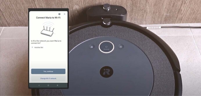
One way to achieve this is to introduce core functionalities, such as Roomba's initial cleaning task, and gradually guide users towards more complex functionalities like advanced scheduling and customization options. This creates an immediate "aha moment" for users, which keeps them happy and engaged. It also sets the expectation that users must continue learning to use the product effectively.
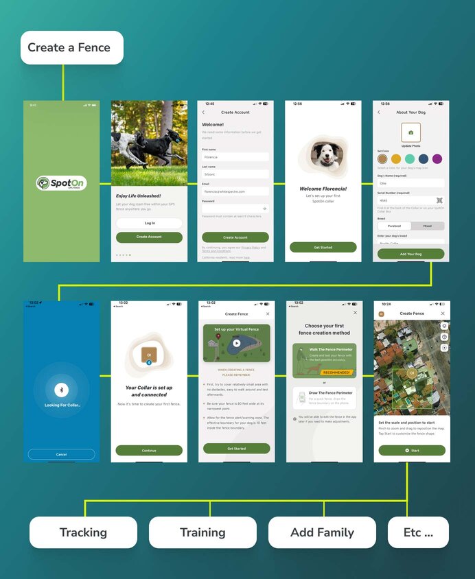
In the case of SpotOn, users' first action is creating their very first fence. This straightforward task gives users an immediate sense of what SpotOn can do. The onboarding process was thoughtfully sequenced, prioritizing this first experience and deferring other critical elements, such as familiarizing the dog with the collar's tones, to subsequent interactions. The goal is to introduce users to SpotOn and its capabilities and gradually build long-term engagement.
3. Field testing is the ultimate design validator
Real-world user testing and feedback are critical for IoT product development. There are a ton of variables to consider, far more than your typical web or mobile application - from how users interact with the hardware itself to syncing behaviors between the hardware, backend, and mobile app to different scenarios around Bluetooth, cellular connectivity, GPS signals and the impact on different mobile devices.
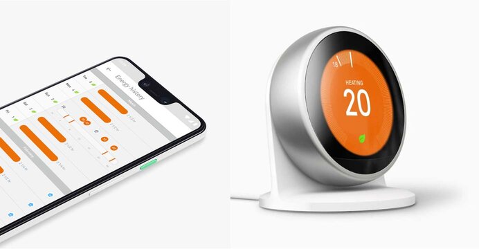
Field testing is essential in validating the functionality of IoT products and understanding how users interact with them. The Nest Thermostat is an illustrative example of how user feedback can improve product features. During early testing, users found the automatic learning feature of the Nest Thermostat, while innovative, confusing and frustrating. The thermostat would adjust temperatures unexpectedly, leaving users unsure why and lacking control. Based on this feedback, Nest added more transparency and user control over the learning process, making it more approachable and trustworthy.
During our journey with SpotOn and their fence-editing tool, we came across an enlightening pivot. Initially, to expedite testing and reduce development efforts, we offered users copies of previous fence designs and removed them after releasing the tool. However, we later realized that users preferred the flexibility of having multiple versions of the same fence for different seasons. In response, we added a fence archive and a fence design duplication option, which the users highly appreciated.
4. Ease the tech language for users
A common pitfall when working on an IoT product is to use too much technical jargon. As a PM or UX designer working very closely with the technical team, you might explain things to the user that they don't need to know. Users shouldn't have to understand the technical details behind the app to use it seamlessly. Like driving a car, you don't need an in-depth understanding of its mechanics.
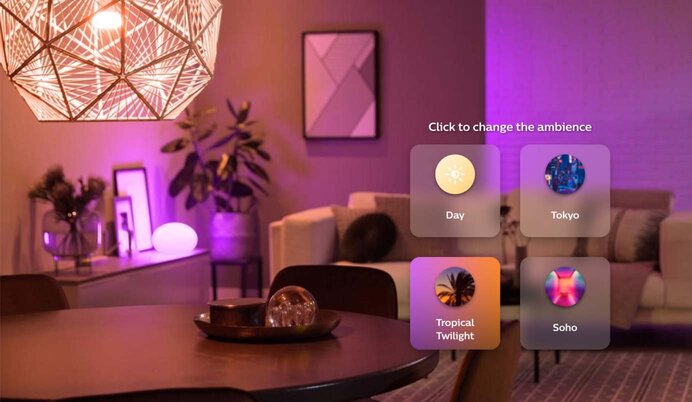
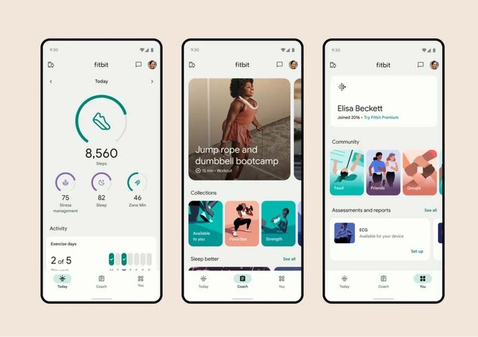
One way to make IoT products more user-friendly is to use everyday metaphors that communicate a close connection and helpfulness. For example, Philips Hue uses terms like "energize" and "relax" instead of technical terms like "lumens" to describe light settings. Fitbit also uses clear progress bars, goal celebrations, and social challenges to motivate users without overwhelming them with complex health data.
Yet, technical terminology like "Bluetooth range" sometimes becomes essential if an issue arises. In one of our projects, users were facing challenges updating firmware via Bluetooth, as it turns out, due to inadvertently exceeding the device's proximity limits. This highlighted the need for clear communication about the Bluetooth range to the users. In these cases, it's critical to provide enough info so users understand what's happening and what to do, without being overwhelmed by details. It's also vital to user-test the copy and visual messaging with a broad range of users to ensure people don't feel lost in these moments.
5. Crack IoT complexities with a comprehensive data strategy
Developing exceptional IoT applications means having clear visibility into the user experience across the many touchpoints. To do this, teams need a central hub for consolidating and analyzing data from various product touchpoints. Keep in mind that IoT requires a different approach than simply installing JavaScript code and waiting for the data to flow in. Instead, because of the many different sources of data, it should be regarded as a distinct, iteratively developed, and monitored sub-project from the start.
Here you deal with various data types, such as sensor outputs, device logs, network metrics, environmental factors, user clicks, and app events. Therefore, discussing with the technical team involved in the beginning is crucial. Here are a few tips to consider:
- Start with core metrics, analyze the data you collect, and adapt your approach based on your findings and evolving needs.
- Keep an eye on the amount of data generated. IoT devices can produce large amounts of data continuously, so prioritize data relevance and invest in robust data pipelines and storage solutions.
- Prioritize user privacy and data security. These aspects are crucial and vary by industry and region. Adapt to these differences and ensure robust encryption, stringent access controls, and comprehensive user consent procedures.
- Start with a small group of internal stakeholders who have the expertise to properly interpret complex data. Once you've confirmed that you're accurately collecting the right metrics, you can develop user-friendly admin tools and dashboards, making this data accessible to any team member who needs it.
6. Ensure seamless UX with an agile firmware upgrade system
It is incredibly important to be able to update and customize firmware upgrades for specific users simply and securely, in the same way as app features through the App Store and feature flags. Poorly executed updates can lead to critical issues like device bricking, data loss, or erratic behavior.
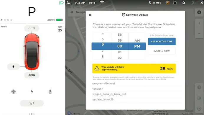
Different products use different strategies. A notable example is Tesla's approach to Over-The-Air (OTA) updates. They have streamlined their OTA process by downloading updates in the background and installing them when vehicles are parked. This method not only improves vehicle performance and adds new features but also effectively addresses security concerns.
From our perspective, prioritizing user transparency and control is crucial. This involves providing clear notifications about updates, options to roll back to previous versions, and flexible scheduling. These elements significantly improve the overall user experience. Equally important is how your internal team is equipped to handle and distribute OTA updates.
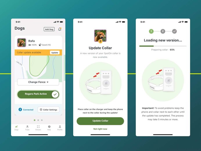
In the case of SpotOn, we enabled their team to release firmware updates effortlessly. They can upload a file through an intuitive, user-friendly interface. Additionally, we've provided SpotOn with the capability to tailor firmware releases for specific audience segments. This is achieved either by whitelisting particular devices in their fleet or opting for a phased rollout strategy. Such flexibility allows for initial testing of the new firmware on a limited user base before proceeding with a wider deployment, ensuring both stability and user satisfaction.
Collaboration is key to successful IoT product development
Applying these user experience-focused product principles can only be done through cross-team collaboration.
This is particularly crucial for products that involve intricate interactions between hardware and software and merge digital interfaces with tangible products - calling for seamless communication across teams.
Success in this space isn't just about a UX designer crafting an intuitive interface or an engineer perfecting firmware. When your organization cultivates a product-oriented mindset amongst all roles, a firmware engineer may suggest a UX improvement or a tester may discover a usability issue.
In short, teams—from UX and engineering to product management and marketing—must collaborate closely to ensure that products are technologically sound, truly user-centric, and market-aligned.
If you want to translate these insights into tangible success for your product and value deep collaboration as much as we do, don't hesitate to reach out.
