Emerging UI/UX Patterns in Generative AI: A Visual Guide
Explore the latest UI/UX patterns in the Generative AI space with insights from Whitespectre’s UI/UX design lead. From iconography, color, animation, labeling and more this guide delves into the key trends to consider when integrating Generative AI into your user experience.
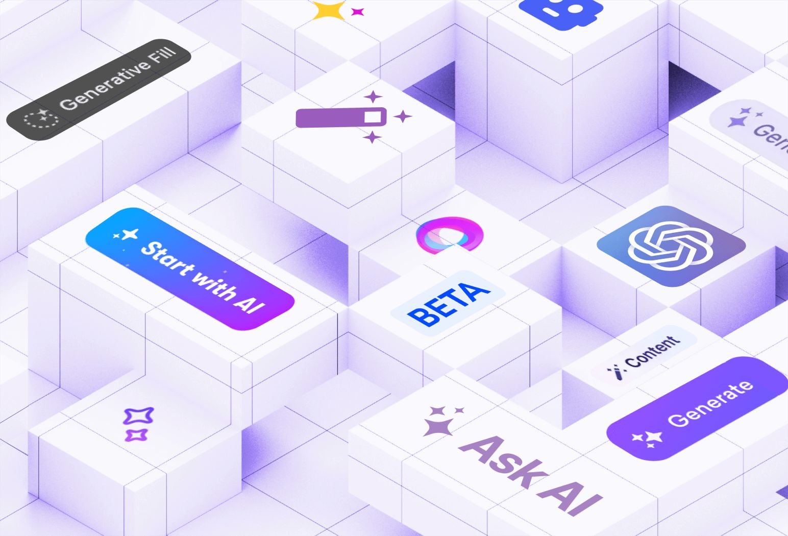
With the major leaps in AI development this year, companies are racing to integrate or expand on Generative AI in their digital experiences and applications. The potential to amplify products with AI is massive. But introducing it successfully in a product also means understanding what will 'click' with users.
What's amazing is how quickly UI/UX patterns have emerged in this space. Over the past year, our team at Whitespectre has been on the front lines of these developments - working with clients and collecting research and references.
So we've put together a mini guide on the patterns shaping this space:
Whether you want to align with industry norms or go against the grain, this guide will help you understand the current trends. Let’s dive in!
Iconography
From sparkles to mysterious orbs to friendly robots - these are the icons shaping our perception of AI, blending the magical with the machine.
Magic Wands / Sparkles
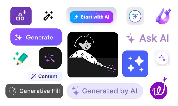
How do you make a disruptive and potentially life-altering technology friendly? By labeling it magic of course! From our review, we see that the most common icons used to introduce an AI feature are the magic wand (we’re including magic sparkles in this as well).
This is hardly surprising given the typical user reaction to some of the new AI tools - “mind-blowing, unbelievable, works like magic!”.
The Orb / Crystal Ball
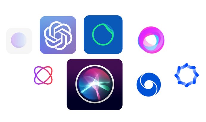
The orb or crystal ball is another popular choice when it comes to showcasing your AI feature.
It can be a more elevated approach than the magic wand, that might be too playful or obvious, so something more abstract can work with your brand. Think Siri for Apple, Spotify’s DJ, or ClickUp AI.
An orb icon or logo can also introduce an element of mystery or even ‘all-knowing’ - which comes in handy if you’re using AI for a recommendation or personalization feature.
Robots
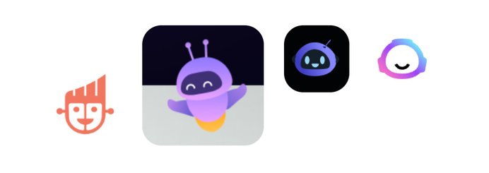
Proving less popular compared to the rest of the emerging design patterns in Generative AI is the friendly robot.
This is a tricky one. Many companies are experimenting with user experiences that attempt to make AI more human- everything from how they’re visually represented to the tone of voice they speak in. Maybe a friendly robot helps humanize the feature, or maybe it just draws attention to the fact that you’re talking to a machine.
Color
What color reigns supreme in the AI design space? You probably guessed it. But if you didn’t, let’s explore why this regal color is emerging as the go-to hue to represent both the allure and prowess of AI in design.
Purple = AI
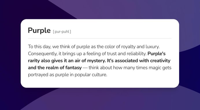
Purple is overwhelmingly the most popular choice for AI. It’s everywhere and usually accompanied or incorporated with gradients. This again is not a surprising choice given the responses to the “magical” new AI technology. So popular is this choice, that it’s now fast becoming synonymous with AI and users will actively be looking for the purple elements to identify AI features or tools.
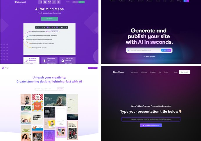
However, color choice in UI/UX goes beyond design trends. It calls for smart design decisions that align with your brand’s identity.
So the question to answer here is not ‘To purple or not to purple?’, but “How can we ensure our AI features are both recognizable and true to our brand?". Take Grammarly for example. They chose brand-consistent greens over the increasingly popular purple to feature their AI tool, Grammarly Go. Instead, they looked to iconography to convey AI-ness. Copy can help as well, i.e. ‘the magic eraser’
Ultimately, it’s about what best serves both your brand and business needs. Just don’t discount purple due to its growing association with AI.
Animation
Generating...
Previously software tasks generally took an imperative approach. Going through various steps/clicks - at the end you get your outcome. Now with Generative AI we can take a declarative approach - we can describe in human plain language what we want, AI does all the work and we get our outcome. We skip to the end.
So how are products dealing with this bigger leap from the input to the result?
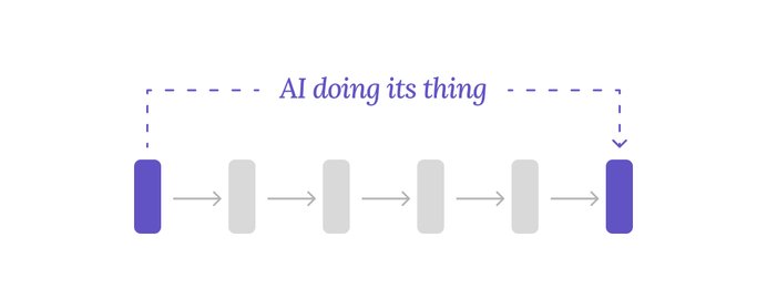
First, animations are used to give the user feedback that something is happening and AI is thinking or doing its stuff. Many of these animations are similar, if slightly fancier, to existing common animations, like spinners or skeleton loaders.
Here are some examples:
Second, a very distinct animation characteristic for AI, is that results are unveiled in deliberate ways to mimic human behaviors or demonstrate thinking/considerations. For example - ChatGPT chooses to show results being typed out rather than just appearing or fading in. While Framer goes one step further and builds designs in the way a designer would, from low-fi wireframes to full fidelity.
Labeling
AI’s here and brands don’t want users to forget it. Let’s explore the two popular ways they promote their new AI features and how designers face the challenge of balancing feature promotion and UX.
We get it, it's AI!
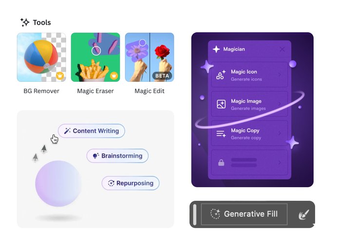
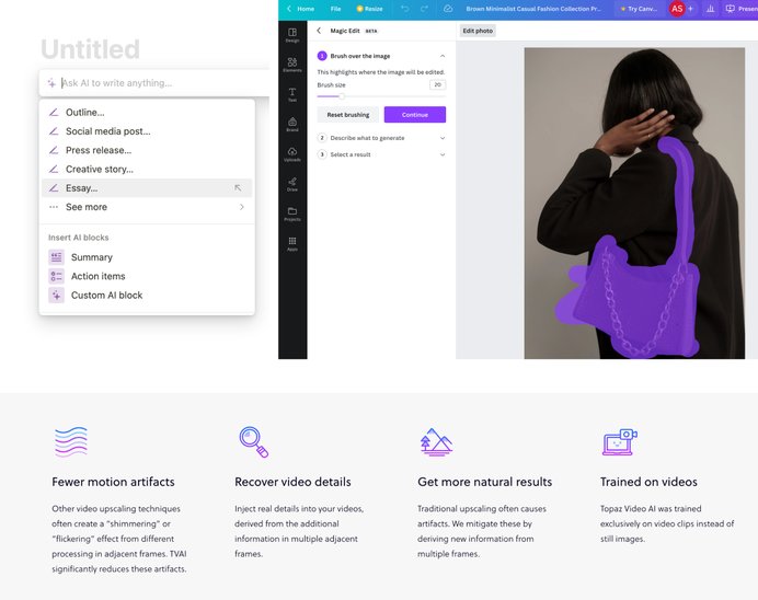
Companies really want you to know about their shiny new toy, like REALLY! Not satisfied with a bright purple magic wand next to the action, the label will invariably include the word “Generate” or be branded with a catchy title like “Magic Eraser”, “Magic Edit” or “Generative Fill”!
Repetition, Repetition, Repetition
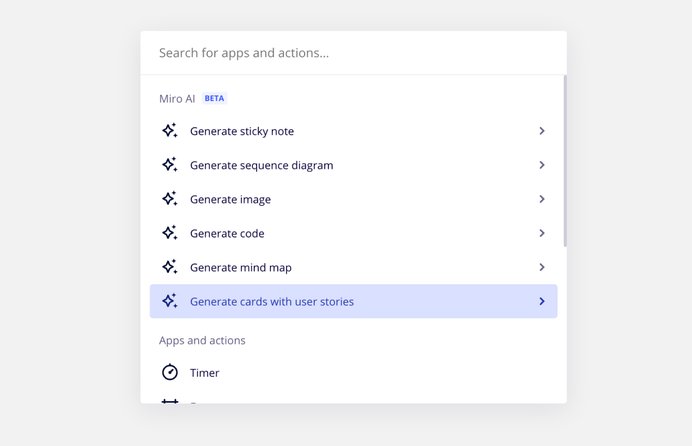
I think this is a symptom of this being a new technology and overtime, as users become more accustomed to AI integrations this will become much more subtle but right now companies are desperate to make the distinction and call attention to their AI features. Even to the detriment of the user interface's scannability - looking at you Miro!
Prominence
Get it out there... Fast!
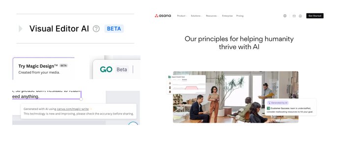
As companies rush to launch their new AI features, we’re seeing a surge in “Beta” badges, “Coming Soon” banners, and disclaimers. Companies are definitely looking to get an edge over the competition or add an enticing upsell on their “pro” level service.
To be clear you should be caveating when things are in early stages in order to set the right expectations and keep trust. Judging by how fast adoption is happening for even experimental AI products, these caveats aren’t a turn off. Furthermore, there are lots of user concerns about each company’s overall approach and principles when it comes to AI.
That’s why it’s also not uncommon to see companies make their positions clear with callouts, modal, or even full pages aimed at reassuring customers about their AI approach.
Summing Up
All these patterns point to AI shouting - "I have arrived! … I am purple, magical, and positioned front and center with the ability to grant your every wish!” … just as long as you have enough credits!
However, it has just arrived. We’re still in the AI infancy and there is very much the feeling this loud new tool has been bolted onto existing products. What will this integration look like long term? - Ultra minimalism with the extinction of whole swathes of user interface actions? As AI becomes table stakes is there any need to call attention or make a distinction between AI actions and the old-fashioned manual ones? As AI begins to understand its user better and better, do we even need a trigger to green-light the “suggested improvement” anymore?
Regardless, it’s a very interesting time to be a user and designer of interfaces and we’ll be watching very closely.
